A discount the customer never notices is a price cut you paid for and got no credit for.
If you want a discount to lift conversion, the buyer has to see it before they decide, not after. The most common reason a volume or quantity offer underperforms is not that the numbers are wrong. It is that the offer only surfaces in the cart, long after the shopper chose a quantity and moved on. Display is not decoration. It is where the discount does its work.
This guide covers the three surfaces that matter: the price itself, the badge, and the cart. Get all three right and a modest discount outperforms a deeper one that stays hidden.
Where to show a discount on a Shopify product page
The product page is where quantity gets decided, so it is where the offer belongs. A shopper looking at a single unit will not go hunting for a bulk deal. You have to put the ladder in front of them.
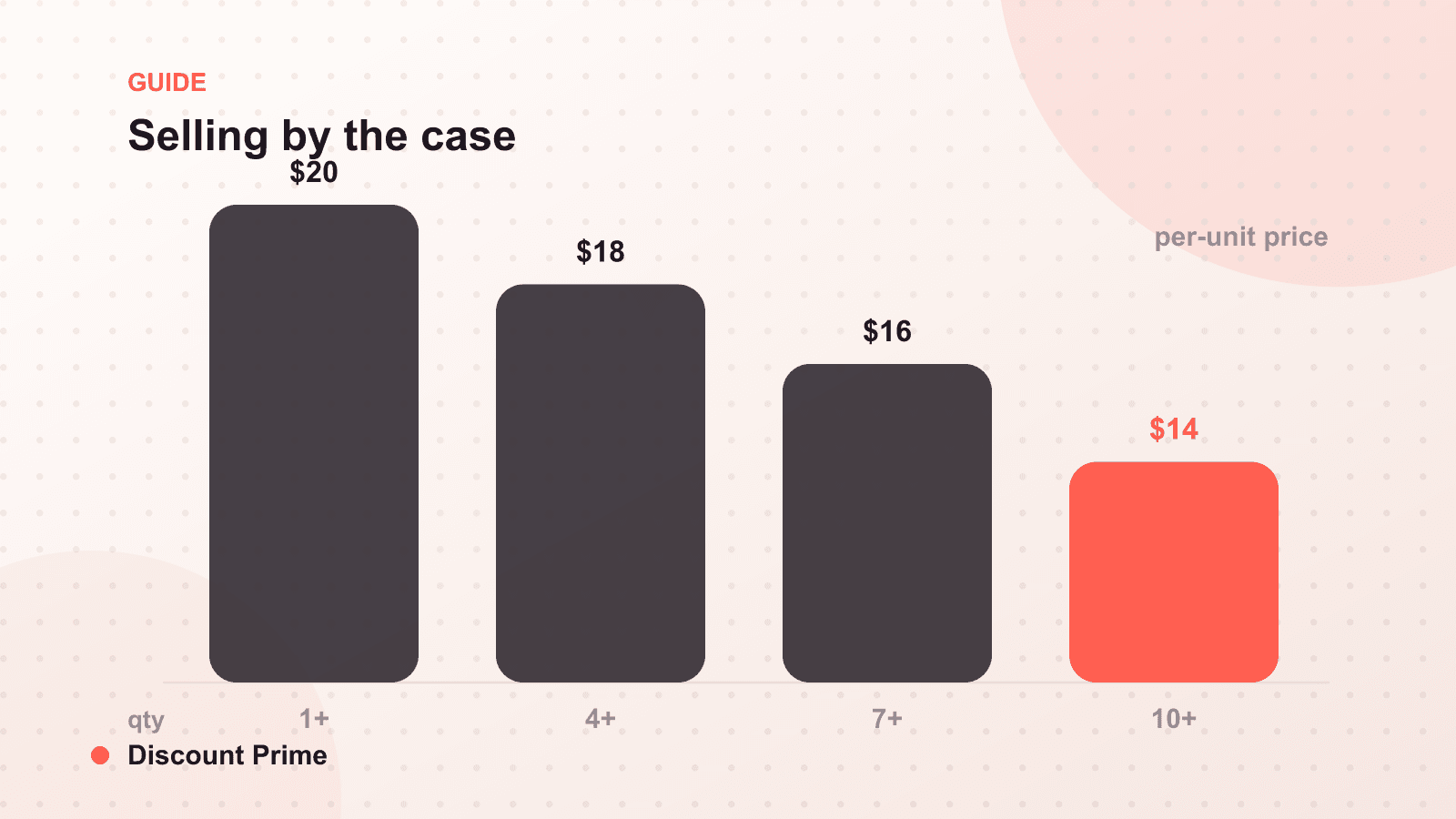
The pattern that works is a compact tier table or bar sitting right next to the quantity selector. Each row shows a quantity break and the resulting per-unit price: buy 1 for $20, buy 3 for $18 each, buy 6 for $16 each. Per-unit framing matters here, because "$16 each" reads as a better deal than "save $24 on 6" for anyone buying consumables or supplies. The table answers the only question the buyer is actually asking: what do I pay if I take more?
Keep it above the fold on mobile. If the tier table sits below a fold of description text, it may as well be in the cart.
Strikethrough pricing and the compare-at anchor
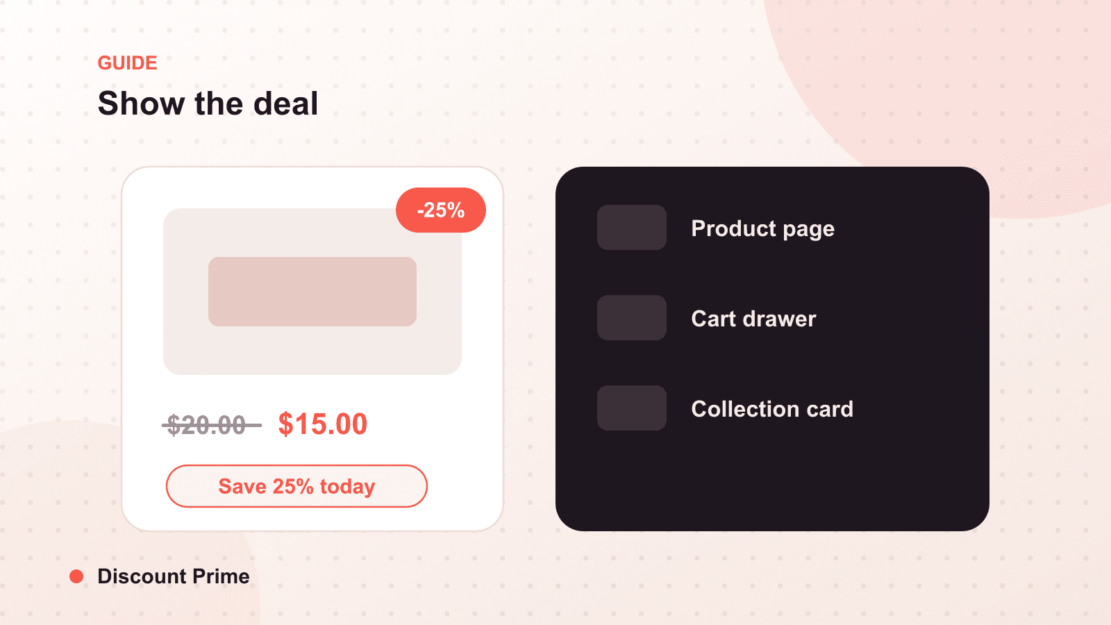
Strikethrough pricing crosses out the original price and shows the discounted price beside it. On Shopify this is usually driven by the compare-at price field, and it is the single most efficient way to make a saving feel real.
The mechanism is anchoring. A price of $16 means nothing on its own. A price of $20 $16 tells the buyer exactly what they are gaining. The struck figure sets the reference point, and the live figure looks like a win against it.
Two rules keep this honest and effective. First, the compare-at price should be a price the product genuinely sold at, not an inflated number, because inflated anchors erode trust and, in several regions, break pricing law. Second, do not leave a strikethrough running permanently. A price that is always on sale stops being a sale and just becomes the price, which trains buyers to distrust the anchor.
Badges: say the saving in one glance
A badge is the shorthand version of the deal, meant to be read in under a second from a collection grid or the top of the product page. It should carry one number and nothing else.
The question is which number. Show whichever looks larger to the buyer at that price point:
- Under about $50, lead with the percentage. On a $32 item, "25% off" reads bigger than "$8 off," even though they describe the same saving.
- Above about $50, lead with the dollar amount. On a $260 item, "$40 off" lands harder than "15% off."
- Pick per price band, then stay consistent within a collection. Mixing formats across neighboring products makes the grid look noisy and makes shoppers do math you do not want them doing.
Restraint matters. One badge reads as a deal. Three stacked badges read as a clearance rack, and clearance framing pulls down the perceived quality of everything around it.
Cart messaging: recover the orders that stalled just below a tier
Some shoppers land one unit short of a break. Cart messaging is the nudge that closes that gap. A short line such as "Add 2 more to save 10%" or "You are $12 from free shipping" turns an abstract tier into a concrete, achievable next step at the exact moment the buyer is reviewing the order.
This is the highest-leverage message in the whole flow, because the shopper is already committed to buying. You are not persuading them to purchase. You are showing them a better version of the purchase they already chose.
Keep it specific and quantitative. "Save more when you buy more" is wallpaper. "Add 1 more for $16 each instead of $18" is a decision.
A worked example
Say a shopper adds 2 units of a $20 product to the cart. Your tiers are 3 for $18 each and 6 for $16 each. Without cart messaging, they check out at $40 and you earned $40. With a message that reads "Add 1 more to pay $18 each, not $20," a meaningful share will take the third unit. That order becomes 3 units at $18, or $54. You discounted the unit price by 10 percent and grew the order value by 35 percent. The display, not the discount, produced the lift.
The display mistakes that quietly cost you
Showing the offer only in the cart. By the time the cart loads, the quantity decision is already made. The deal has to appear on the product page.
A tier table nobody can parse. Five tiers in a cramped table is worse than two clear ones. Show the breaks that matter and let the per-unit price do the talking.
Permanent strikethroughs. An anchor that never moves stops anchoring. Schedule the end of a promotion when you create it.
Inconsistent badge formats. Percentage on one product, dollars on the next, both on a third. Consistency inside a collection is what makes the grid readable.
Setting this up with Discount Prime
Discount Prime renders your offer where it earns its keep. Quantity tiers on a product show as a clean tier table by the quantity selector, savings appear as strikethrough pricing and a single badge, and cart messaging nudges shoppers who stalled one unit short of the next break, all without duplicate variants. Design the volume discount or quantity break once, and the display follows automatically. For the structure behind the numbers, start with our complete guide to volume discounts, and if you sell in case packs, see unit pricing and bundles. You can install the app from the Shopify App Store and have a first campaign live in minutes.